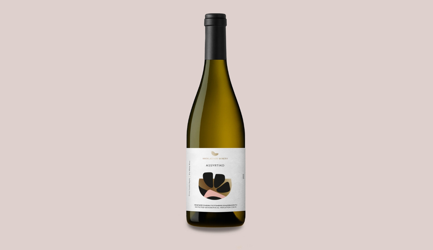
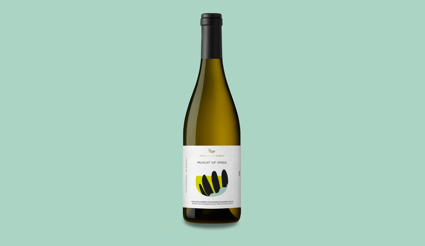
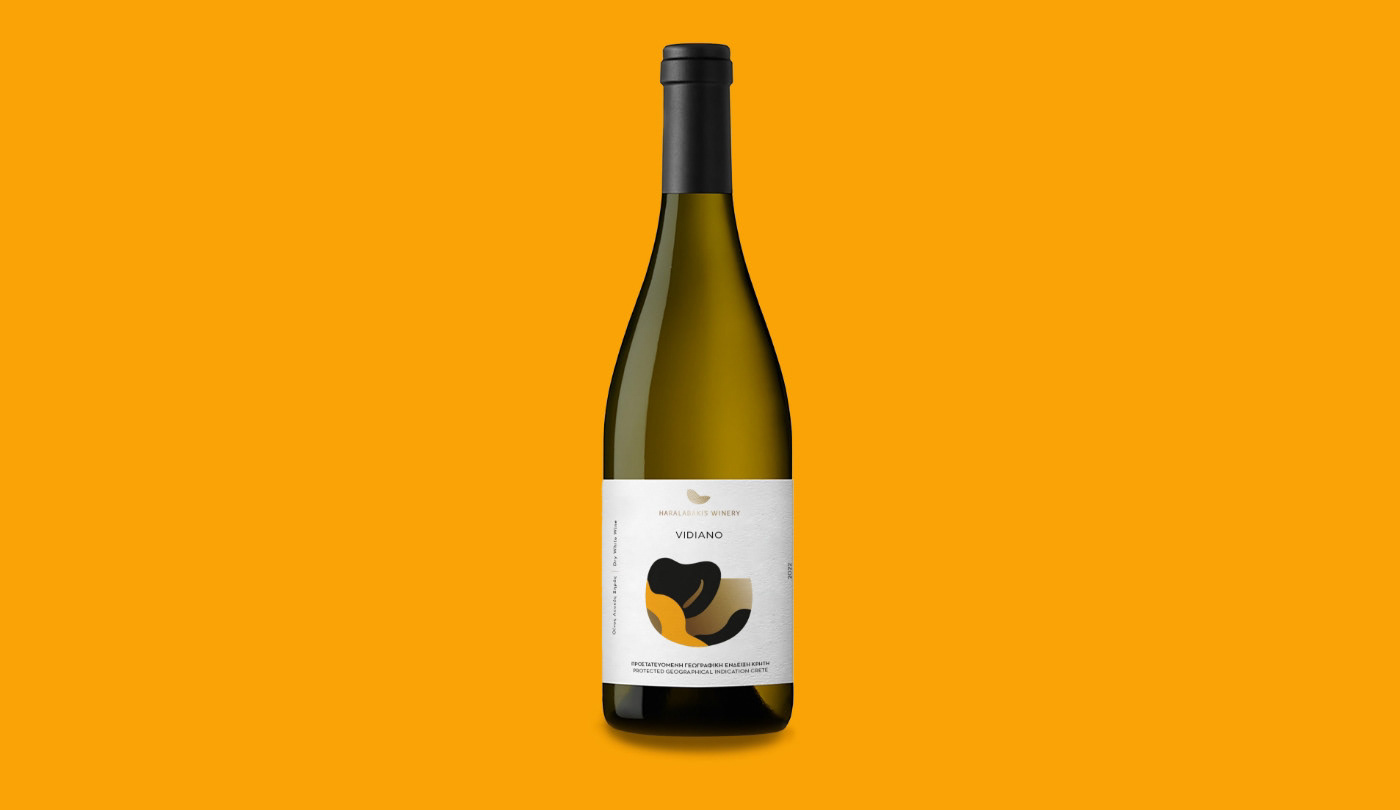
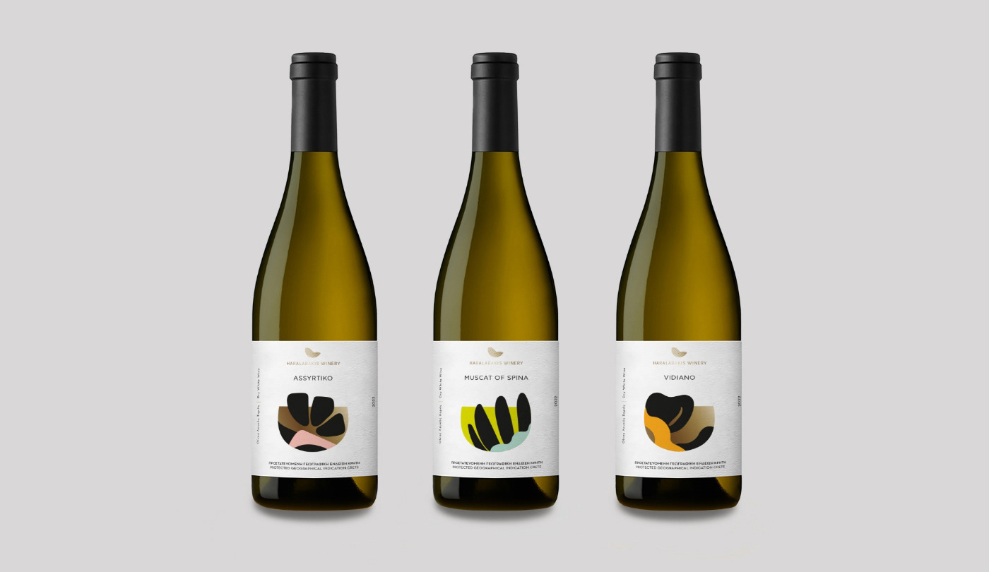
For the Haralabakis Winery packaging series, the objective was to translate the complex character of Cretan grape varieties into a contemporary visual language. My approach focused on visual distillation: moving away from traditional, illustrative wine labeling to embrace an abstract, conceptual framework.
Each label acts as a study of 'terroir' through form and color. By utilizing organic, hand-crafted shapes, I created a distinct visual code for each varietal (Muscat of Spina, Assyrtiko, Vidiano), while maintaining a rigorous design consistency. The high-contrast interaction between the textured, tactile paper and the bold, graphic elements bridges the gap between the ancient craft of winemaking and modern minimalist aesthetics. This series serves as a silent storyteller, where the purity of the design invites the consumer to discover the essence of the wine before the bottle is even opened."